
RAWVERASkincare
A considered kind of care.
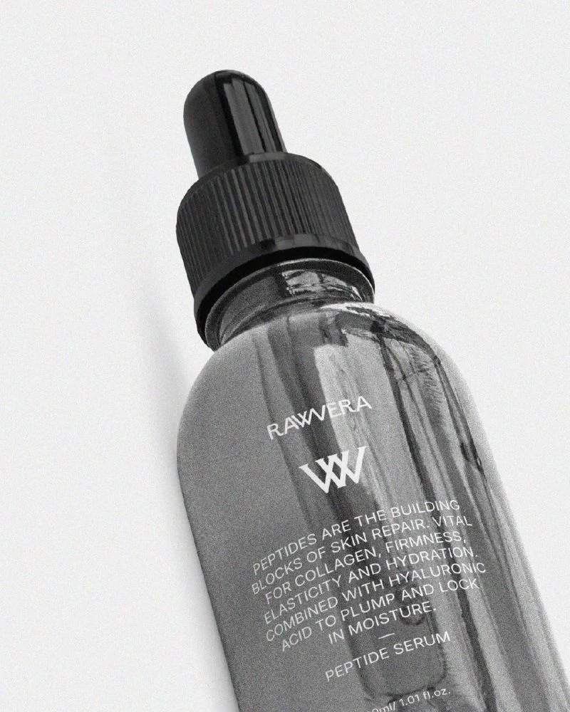
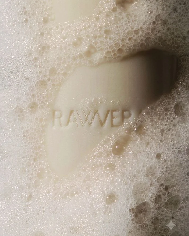
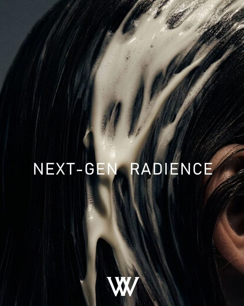
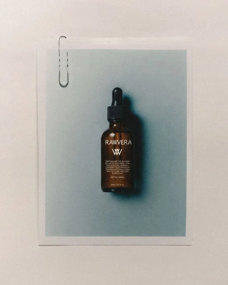
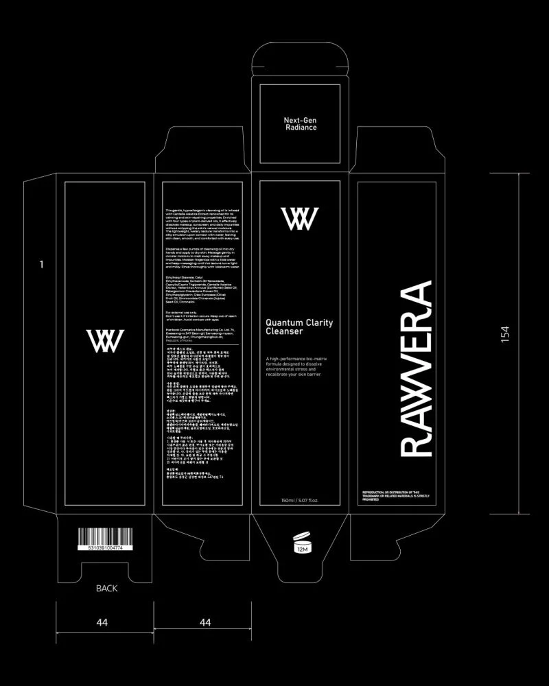
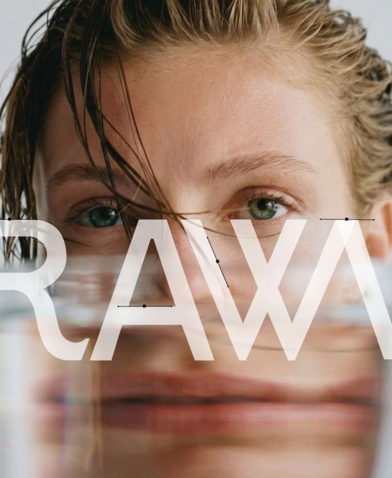
For RAWVERA, we brought a clear, editorial sensibility to skincare. A custom monogram, restrained typography and tactile packaging give the brand a presence that feels precise and personal.
The identity works at two distances: a confident first impression on the shelf, and details worth noticing in the hand. Texture on the bottles adds a physical dimension to the otherwise spare visual language.
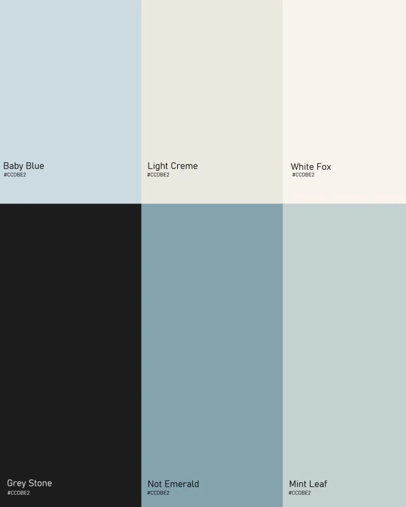
Soft mineral colours, close-up imagery and generous space carry that balance across the brand. Designed to communicate efficacy with a distinct point of view.
THE EXPRESSIONBrand identity & packaging
A GOOD PLACE TO START
What are youworking on?
A new business. A new chapter.
A brand that could work harder. Let’s talk.