
LifeOriginsWellbeing
A clearer picture of wellbeing.
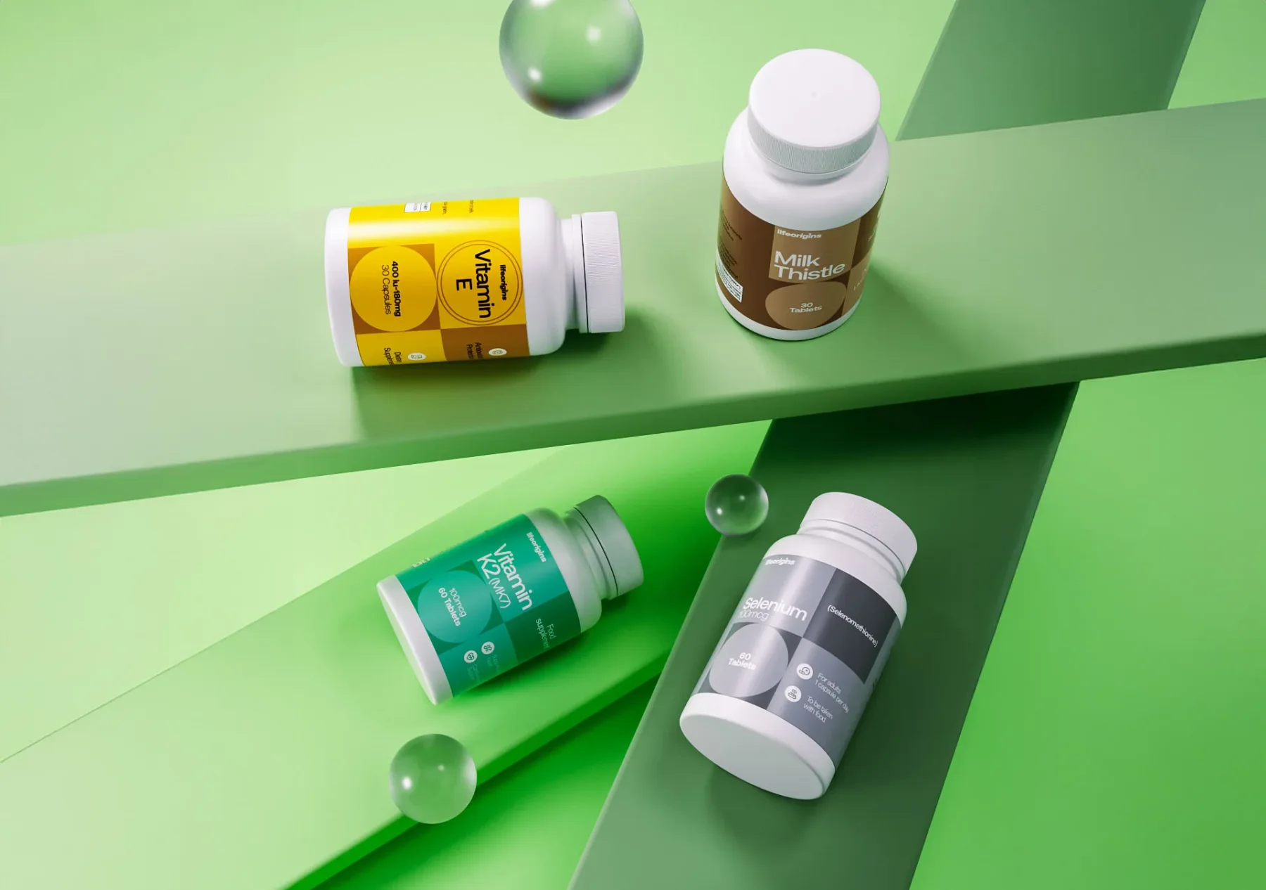
A supplement range needs to be understood at a glance. We created a visual identity and packaging system for LifeOrigins that puts clarity at the centre.
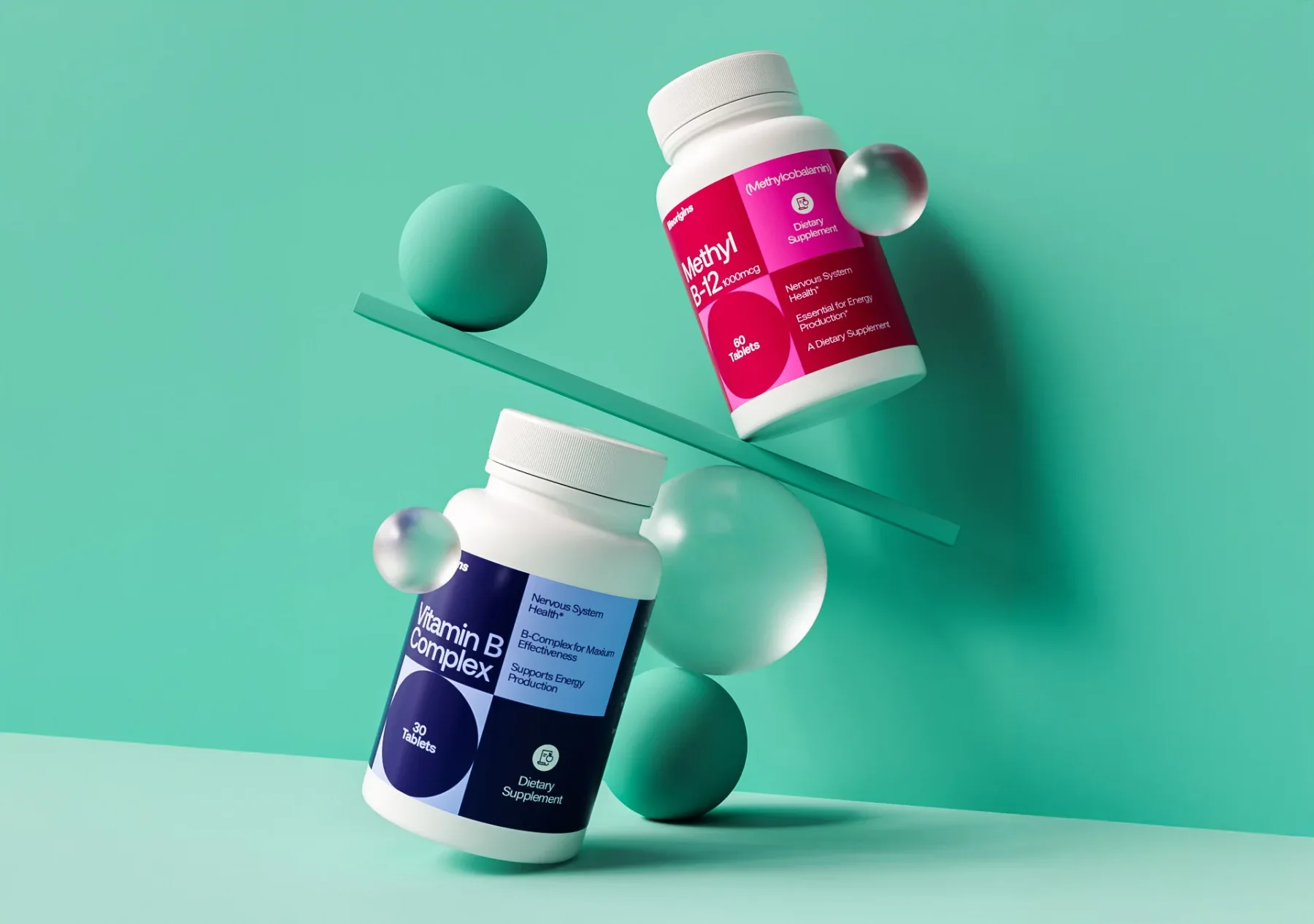
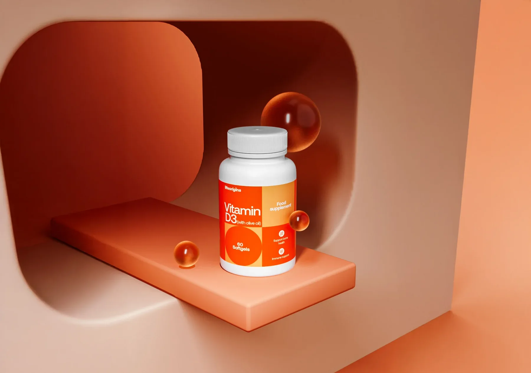
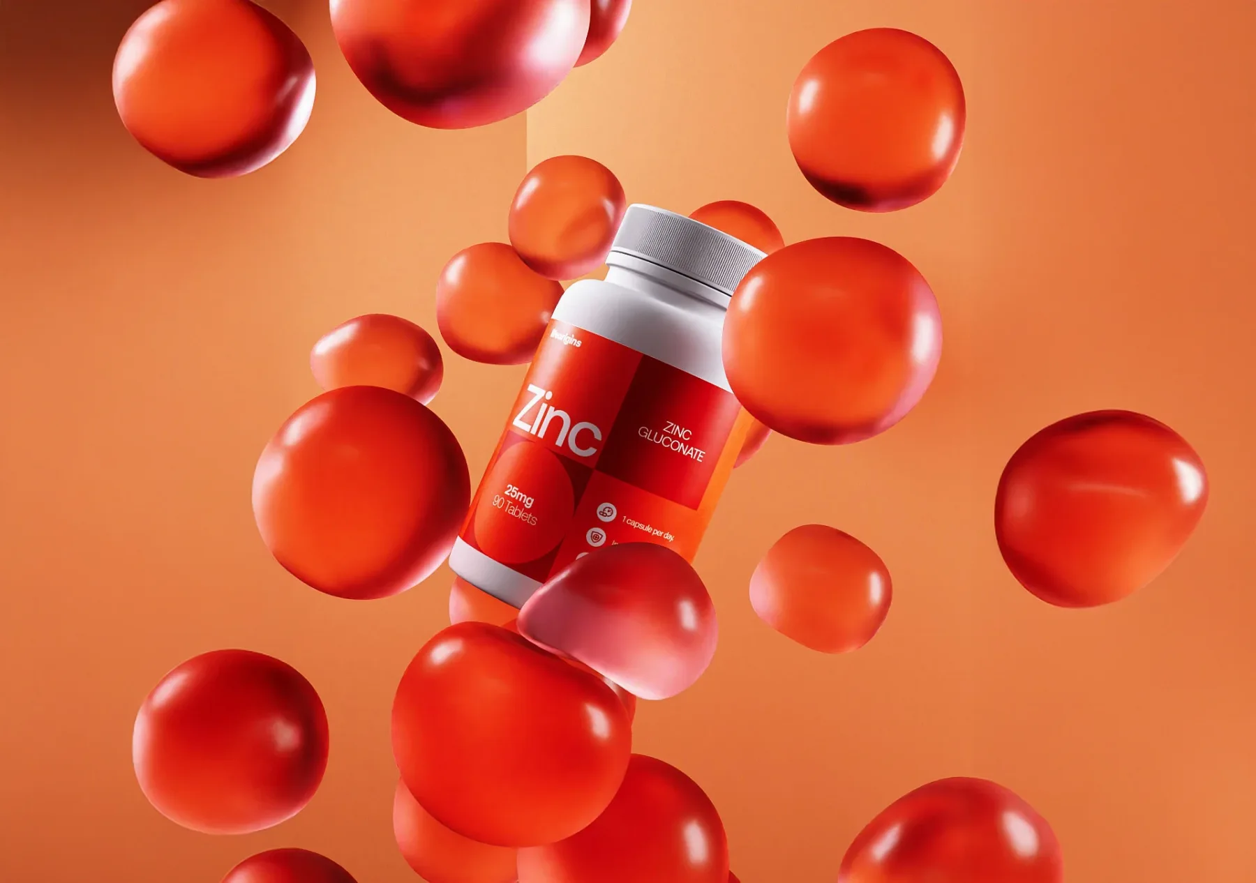
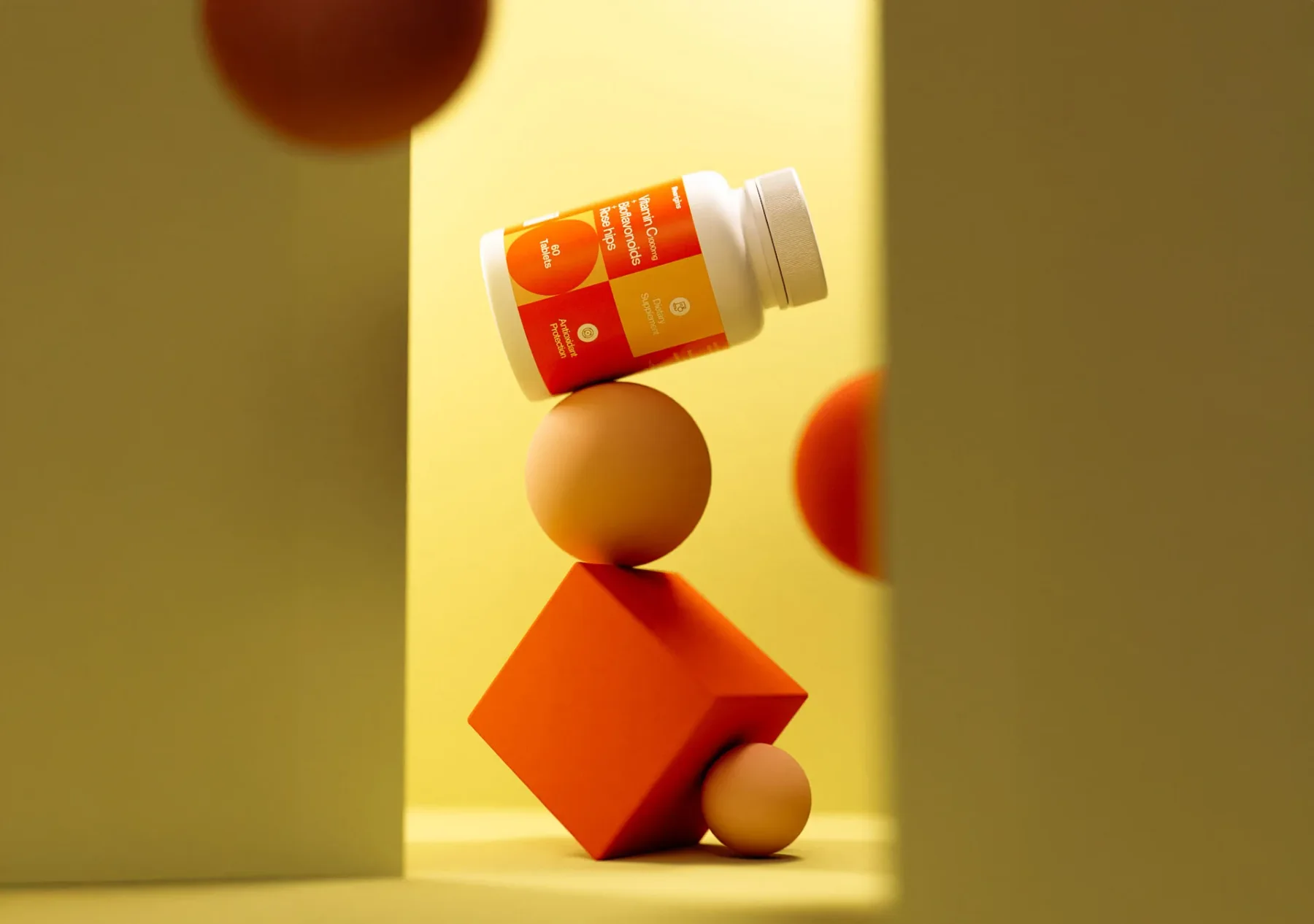
The logo and labels give the range a coherent family resemblance. Carefully composed 3D scenes show how the packaging lives in the world, bringing colour, light, and depth to the product presentation.
THE EXPRESSIONIdentity & packaging
A GOOD PLACE TO START
What are youworking on?
A new business. A new chapter.
A brand that could work harder. Let’s talk.